

The design aspect of a web application is a daunting task for many developers. Design should aim to make a product useful, aesthetic, understandable, and give the user access to its subtle complexities. This post is the first in a three part series on Google’s Material Design. My goal in the series is to explain how Material Design can help developers achieve these traits in their design, how to get the most out of Material Design, and how to implement Material Design in a Salesforce Visualforce app. It is written to help developers utilize Material Design when designing custom interfaces and software for Salesforce.
This first part overviews Material Design so a developer can understand what its strengths are and decide whether or not to use it.
What is Material Design?
In April, 2015 Google released a specifications document called Material Design. It was made to serve as a guideline for designing apps that would be uniform across all platforms, devices and screen sizes. In the year following its release, several web frameworks, libraries, and templates have been created or adapted to follow these principles.
Material design demystifies the process of designing a web application and provides tools a developer can use to quickly build a well designed application. When the process of design has a logical progression, any arbitrary randomness around how to implement a design fades away. The developer can then focus on solving the problem at hand instead of getting distracted by unimportant design decisions like layout tweaks and pushing pixels around the page.
Components
Material Design components act like the building blocks for creating a mobile and desktop application. The spec reads like a set of rules to follow when implementing common components. Each individual component has suggested usage rules which help the end user understand what to expect when they explore a new part of your application. For example, an application may implement several types of lists, but all lists with a secondary action should float the action to the right. If there is a primary action, it should act when you click a list item. The end user should have a subconscious understanding of this pattern, and will come to appreciate it when the same pattern is applied to components like cards, contact chips, data tables, and toast notifications.
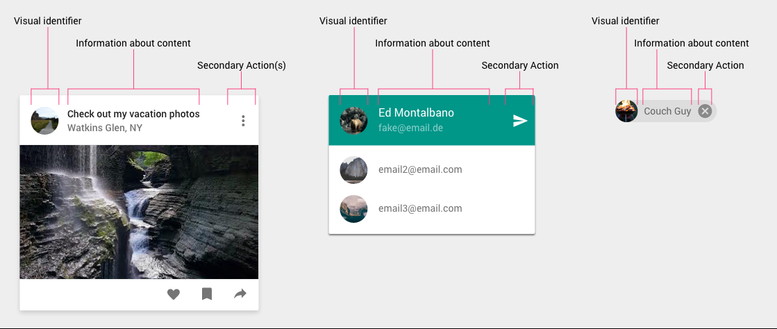
Ex. A card, a list, and a contact chip all using similar spatial patterns in their respective layouts.
Mobile and Desktop
When the user loses 80% of their screen, the remaining 20% must have targeted and concise information the user needs. Building a mobile application which has most, if not all of the functionality of its desktop counterpart is a serious pain point nearly all web developers will eventually run into. Some developers say you probably shouldn’t bother creating a custom mobile app. Others warn you not to make the responsive version of your website pretend to be a mobile app. Material Design can help with building a responsive version of your app which looks and feels natural in both mobile and desktop environments. If you need to take it a step further, you can use tools and frameworks like Flutter to implement Material Design in Native Android and iOS applications.
Fonts, Colors, Icons, and Style
The Material Design spec tries to standardize the many options a designer or developer may face when establishing a style for their web application. When selecting a text font, Roboto 2.0 is recommended for most text, and Noto sans is recommended for CJK (Chinese-Japanese-Korean) and as a backup to Roboto. Roboto is developed by Google and is tailored for cross-platform support. For iconography, the spec provides a library which contains the iconography used in the native Android OS and in Google apps. Picking a color scheme and applying colors to your application are clearly defined in the section on color. There are even writing guidelines for making the language in your application clear and concise.
Establishing a style for your application using these guidelines are explained in more detail in the second part of this article.
How Does it Compare?
If you are familiar with Bootstrap, Foundation, or other responsive web frameworks you will be able to pick up Material Design fairly quickly. They all provide a layout system and components for quickly building a mobile friendly webpage. The key differences are in maturity, prototyping and components provided.
As of November 2016, Material Design is fairly new. It was released solely as a specification and does not provide any code for implementing the spec on the web. After a few months, several different adaptations came out. Now, there are four major flavors to choose based on how you plan to implement. Choosing between those flavors is described in detail below. It will still take some time for a solid plugin ecosystem to develop, similar to Bootstrap’s developer community.
One major thing Bootstrap, Foundation, and many other web frameworks have in common is the ugly, generic pages you get out of the box. They require heavy customization to get a good looking aesthetic which is appropriate to your audience. In my experience, Material Design does not require as much customization to get a well designed prototype into the hands of stakeholders or test users.
Many web frameworks share several common components which only have one or two ways to implement. Material Design introduces several new components which are versatile enough to adapt to several different types of situations. Some of these components are quickly being adopted as standard components. Cards, for example, are coming to Bootstrap in version 4 to replace wells, panels, and thumbnails.
Choosing a Flavor
There are four major flavors which should cover most use cases: Polymer, Angular-Material, MaterializeCSS, and Bootstrap-material-design.
Angular-Material
If you are starting from scratch and familiar with or willing to become familiar with AngularJS, Angular-Material will most likely be your best choice. If you are willing to convert an application to Angular, or want to build a new module such as a community portal in Angular, this still may be your best bet. Its development is directed by Google and within a year it will likely stand out as having the most advanced developer ecosystem. There are two versions of Angular-Material: Angular-Material 1.x for use with Angular 1.x and Angular-Material 2 for use with Angular 2. Angular 2 is a complete overhaul of the framework which now supports multiple scripting languages and changes several major fundamental concepts.
Polymer
Polymer is the most serious implementation of Material Design and most closely follows the specs when compared to any of the other three options. Polymer is recommended if you are willing to learn a new (albeit simple) way of coding views and components and the project you will be working on is large in scale. Polymer’s core concept is an extendible, reusable, self-contained component system which separates concerns between different components. HTML, Javascript, and CSS for a component are all contained in a single HTML and shadow DOMs are used to prevent inefficient CSS rendering when parsing the DOM (the styles are only applied to its specific shadow DOM) and style/scripting rules from bleeding into other components. Polymer plays nicely with Angular 1 and 2 with the use of a Polymer binding directive in Angular. Salesforce can also be easily used as the backend and you can completely rely on Polymer to create the application.
MaterializeCSS
If Angular is off the table and you do not currently rely on a CSS framework like bootstrap, Materialize is currently the most advanced CSS framework implementation of Material Design.
Bootstrap-material
If you absolutely need to use bootstrap and cannot get materialize to play nicely with bootstrap, bootstrap-material-design is available. It will require heavy customization to get working, and you may be better off hand coding the components your application will rely on.
Takeaway
The Material Design specification is only a guideline to help teach principles and application of good design. Good design is not defined by adherence to a design specification, but by its appropriateness to its audience and goals. Careful consideration of your users’ needs and thoughtful reduction of unnecessary complexity is the only methodology you need to create a well designed application.
The next part of this series is for developers looking to learn how to use material design in more depth (coming soon). You can use it as a primer to better understand Material Design before diving deeper into Google’s spec document.