

The previous part of this series gave an [[[overview Material Design]]] and why you would want to use it in a custom Salesforce app. This article will give you in-depth understanding into some of the design decisions so you will be more prepared to [[[implement Material Design in Visualforce]]].
Material Design Components
Material design components are a quick way to add structure and show intent around your content. Proper use enables you to display information in a consistent way by building upon several common patterns. Maintaining consistency throughout the application gives your application an aesthetic and accessibility users will appreciate when learning to use your application.
If you are familiar with web frameworks like Bootstrap, Material Design components follow the same principles as Bootstrap components. Some versatile components for getting started are cards, lists, data tables, and dialogs.
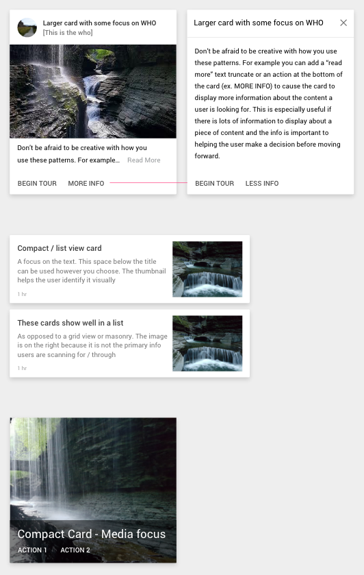
Cards
Cards display a basic preview of an item. They are typically used when listing items that can be opened. They present details, features, and actions for an item, and should serve the purpose of letting the user interact with an item intuitively and as quickly as possible.
How to present your data is a matter of personal preference. The focus in designing should be giving the user only the information and interaction they would want or need on that page. By limiting what information you show, the user will be able to make a decision about an item faster, resulting in a happier user and a better user experience.
If the person who owns or posted an item is important, you may want to have that information displayed at the top of the card as it is in the first example to the right. You can also use a sliding content pane to show/hide information on the card with a ‘Read More’ link or ‘More Info’ action. Be wary not to stuff too much information into a card. It may make more sense to have the user move to a new page if they need more information about an item.
Sometimes, it will be beneficial to show the user more than three lines of information about a list item. Cards can be used like a speciality list to display more information about an item. Again, this should only be done if the user will not be able to quickly work with the list unless that extra information is present.
If you are displaying content with a focus on media, you may be better off using a compact card which shows a thumbnail, title and secondary content like actions or a description.
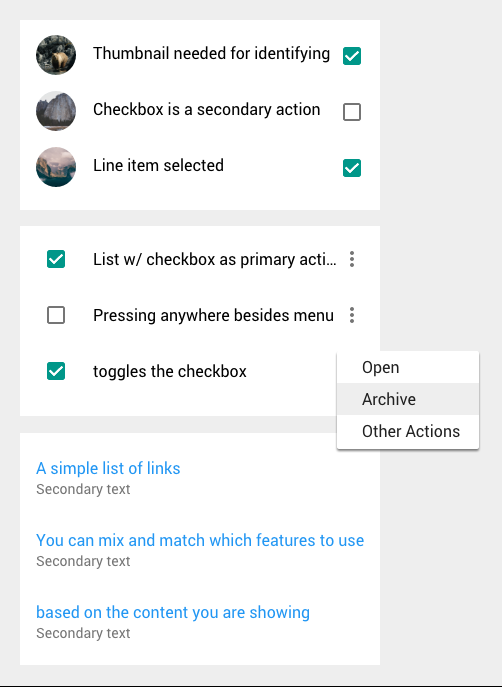
Lists
Material Design lists are an extension of the traditional list. They are made up of primary content on the left and secondary content on the right. The primary content may be a thumbnail and the title of the list item, or a checkbox and the value you are including. The optional secondary content may be the primary action you are performing on the item, or if you need to expose a series of actions you can add a vertical ellipses and link that to a menu.
Data Tables
Salesforce and tables go hand in hand. If you have ever inspected the source code Salesforce generates with Apex, you may have noticed that Salesforce loves tables enough to put tables inside of tables just to generate a section header.
The Material Design spec on tables lends a couple of rules for consistency and style when displaying table data:
- Tables are meant for 3 or more columns of data.
- Hovering over a row should highlight the row to enhance readability of the data in the row.
- Give each row a border rather than having a different background color on every other row.
- Align text to the left of the cell, align numbers to the right of the cell.
- The header of a sorted column should be a darker shade of black (87% rather than 54% black) and have iconography to indicate the sorting direction.
Dialogs
Dialogs are a modern step in the evolution of the popup. They are a short concise call to action or piece of information the user should immediately address. The immediate nature of the dialog means the developer should not open a dialog from inside another dialog, the user should not be able to open a dialog without an existing dialog being dismissed, and the user clicking outside of the bounds of the dialog should close that dialog where applicable.
Dialogs should be used sparingly and their lifespan should be short.
Rather than having the user confirm an action with a dialog, consider performing the answer and using a Snackbar to inform the user of the action and allow them a window of time to undo it. This pattern should only be done with changes that can be reverted manually by the user at a later time.
The language used in a dialog is a major part of keeping a dialog’s screentime short. Write dialogs with the goal of letting users scan the contents of the dialog to get the information they need to act. Here are some checks you can perform for improving writing in dialogs:
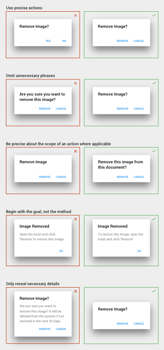
To maintain consistency, Material Design recommends using the appropriate verb below for non-custom actions:
- Next – Forward in a multi-step process.
- Back – Backward in a multi-step process.
- Done – Confirms completion in a multi-step process.
- Dismiss – To remove a dialog without any consequence.
- Learn More – Takes the user to additional content.
- OK – Allows the user to confirm an action.
- Cancel – To cancel an action.
- Skip – Allows the user to avoid interruption and proceed with a task.
- Got it – Similar to OK and Dismiss, but for signifying that the user should understand the contents of the dialog before moving forward.
- No Thanks – Allows the user to decline.
- Not Now – Only used when the call to action is essential to the functionality of a product, but the user can temporarily postpone the action..
Animation
Transitions in a web page allow us to present information to the user by directing their attention to what is happening on the page. When the state of a component changes, an animation can explain to or inform the user that a change has happened. Material Design outlines several animations and best practices for conveying this information.
When interacting directly with an element, the element should react. Elements like buttons, selectable list items, and thumbnails should show a ripple when pressed. This gives the user instant feedback and informs them that the action they just performed is beginning an interactive process.
When moving between states, a page-wide animation can be used to inform the user about the state they have just moved into. For example, imagine a user clicking a thumbnail and everything on the page is faded out except the thumbnail. Then, the thumbnail grows and moves to another part of the page while new content is faded in. There should be no question in the user’s mind that they are now on the details page for the record associated with that thumbnail.
When adding a transition to multiple items, the items should stagger rather than come in all at once. There should be a linear path for the eyes to follow. If it’s a list of items where each item has its own row, the animation should go from top to bottom and the beginning of each animation should be offset 50-100ms after the beginning of the prior item’s animation. If it’s a grid of items, imagine a line going from the top left element to the bottom right element. That’s the flow the sequence of animations should follow. To stagger this, you can be exact and calculate when a line perpendicular to the previous line would intercept with the center of an item. Or you can do it the simple way and delay the item’s animation by ((x*40) + (y*50))ms, where x and y are the item’s column and row index number.
Color
When I first started programming, I made a mistake I see many non-designers make frequently. I used #000000 black. I did not know the improvement I would see by keeping all colors on the page lighter than #212121. I wish the specs had been around when I was first learning how to improve my web design skills. There are many rules like this which help maintain a consistent aesthetic, and the Material Design spec facilitates these rules well without needing to know all of them. Sensible color choices may be one of the most alien concepts to developers without any background in design. Color should convey some information. The primary color sets the mood. The accent color accentuates interactive components. Grayscale highlights or deemphasizes components by their importance or current state. Learning about the design spec for picking colors may help you design your own color scheme without the Material Design recommendations.
To select a color scheme, material design recommends using one of its 18 colors as your primary color and then selecting one of the muted (a100-a700) colors to serve as the contrasting accent color. Primary colors like Light Green 500 are vibrant and draw a user’s attention in. Accent colors like Deep Purple A200 give you a contrast so your application doesn’t become a sea of green and inform the user of interactive components.
If the brand you are materializing already has a color scheme, or if you think these colors look too much like the lego colors, don’t worry about using Google’s recommended colors.
Material Design uses six shades of grey on a light background. There are four shades of grey used for page elements and three shades of grey for backgrounds and surfaces:
| Text | 87% black (#212121) |
| Secondary Text / Icons | 54% black (#757575) |
| Disabled / Hint Text | 38% black (#9E9E9E) |
| Dividers / Page Status Bar | 12% black (#E0E0E0) |
| App Bar | 4% black (#F5F5F5) |
| Page Background | 2% black (#FAFAFA) |
It is recommended you use rgba(0,0,0,0.XX); rather than the hex code for page elements. When placing page elements on a lightly-colored background, the hex values cause the elements to stand out rather than blend.
Prototyping
Prototyping is an invaluable tool for addressing a stakeholder’s and a user’s concerns. It can be effectively used to steer the development timeline in a direction everyone will appreciate. Here are several tools that help aid the prototyping process:
- Pen and Paper – Gettings a draft onto paper is a quick way to validate your ideas and play around with possible solutions. Alternatively, if you have a drawing tablet and a stylus, you can use AutoCAD’s Sketchbook Pro.
- Wireframing – Adobe Experience Design (XD), Sketch, Axure, Photoshop, and Illustrator are all great programs for creating a wireframe or interactive prototype. A component sheet for Photoshop, Illustrator, and Sketch is provided by the Material Design team and can be found here. A 3rd party version for Axure can be downloaded here. Adobe XD comes with built in support for material design.
Now that you have a better understanding of the design specification, you will be better able to implement Material Design in your next web application. Below are some examples of custom Salesforce apps which we have built using Material Design to inspire you:
Task prioritization and scheduling utility. Drag and drop functionality for ordering which tasks should be done next. Hierarchical listing of child tasks.
Referral search and data entry tool. Entire application can be navigated via keyboard for improving how quickly caseworkers can convert their paper documents to an entry in their system.
Org Health Checker. Incomplete app which logs into and builds reports on any Salesforce org for helping consultants search through and diagnose potential issues.
Approval UI. Streamlines the process of making approvals by bringing all of the relevant information needed to make a decision to one place. Allows users to mass approve/deny records and maintain the standard Salesforce audit record.
Useful Resources
https://material.google.com/ – The official spec.
http://www.materialui.co/colors – Picking colors.
https://material.io/icons/ – Official material design icon list.
https://materialdesignicons.com – Another MD icon resource.
https://material.uplabs.com/ – Design inspiration.
The article in this series go over [[[implementing Material Design in standard Visualforce with MaterializeCss]]].