

Welcome to the second blog in a three-part series! My first post focused on User Experience Research (UXR) with a short primer on user interviews.
You’ve done your user interviews. Now what? Your next steps come from the backlog these interviews uncovered. Now’s the fun part, you prioritize and find easy wins for rapid deployment or user training.
In addition to what you find in your organization, below are some easy wins and themes that I see while consulting with multiple customers. These are generally quick fixes that are easy to implement and empower users to make changes independently.
Make it Easy to Log In
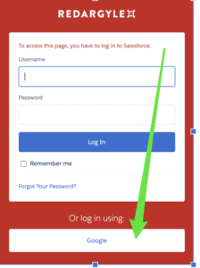
Adoption soared at Red Argyle when we enabled Single Sign-On (SSO) to log in (and with MFA requirements, this may help both fronts!).
SSO isn’t completely an Admin effort, but any Admin can champion the need to implement SSO. Imagine no more password resets; users can log in through your current identity provider. (for us, that’s Google).
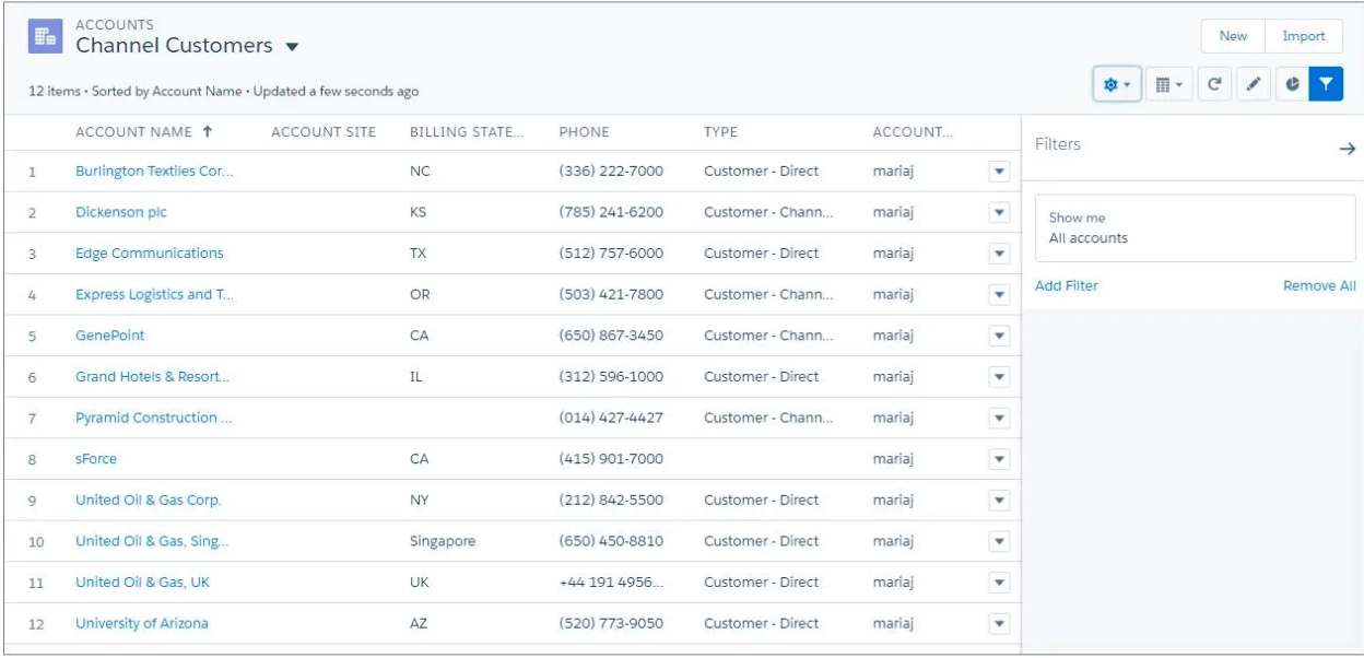
List Views are Still King
It’s easy to underestimate how essential List Views are to workflows. When was the last time you audited and refreshed list views for users?
Ideas for a List View Audit
- Clean up the overall list of list views and reduce “noise.” So many times, I find a plethora of one-offs that aren’t relevant.
- See if there are trends to List Views created by power users that may benefit everyone.
- Check to make sure naming conventions are consistent.
- Confirm documentation/training shows users that List Views are great tools.
- Maximize UX features of list views. Consider Split View, Kanban View (my favorite) for tasks.
- Remind users how to pin their favorite list views so they render first. Every mouse click saved is productivity earned!
- Many users don’t know how to modify criteria or create their personalized views. So a 15-minute working session may be transformational for them.
List View Resources
- Check out this Salesforce article on setting up a Kanban View
- Take a look at this Salesforce Trailhead module covering how to configure List Views
Favorites are my Favorite

Favorites is a very underutilized feature that makes repeated access to records easier. The Favorites icon is in the upper right corner of your Salesforce Lightning pages.
Favorite Salesforce Favorites Use Cases
- I “Favorite” active deals, so it’s easy to jump to the opportunity record and make updates.
- In Time Entry, I usually have 2-3 tasks during a sprint that I’m billing to. I Favorite them, so they are top of mind and easy to grab.
- I add my most used list views to Favorites to make it easier.
- I Favorite often—used reports and dashboards.
Read about creating shortcuts to Salesforce pages with Favorites.
Field Order is Huge
How fields are laid out on a page can greatly impact usability. Therefore, I like to keep the following universal truths in mind when auditing and editing layouts:
- Only have the minimum fields needed on the page that support the business process.
- Group similar fields together (I like to have all required fields together).
- Every field should have an easy-to-understand name, AND every field should have helpful help text (describe the field’s function and purpose in downstream impacts, essentially the “why” of the field).
- There are many options for how to lay out Lightning pages in addition to where fields are, such as related lists to minimize clicks.
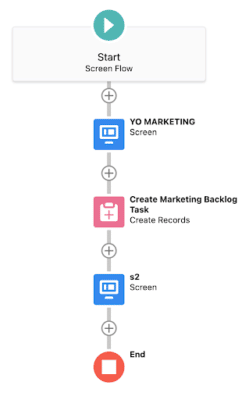
Use Flows to Support Top Tasks
Some business processes are inherently complex, whereas you need a vast page layout with tons of fields to capture the correct information and possibly create related records. These interactions are often fraught with user frustration and errors.
Now is a great time to consider a flow in which a button click kicks off a wizard that guides users through the process. We use flows for many things in our org, including time-off requests and submitting various types of tickets. Flows guide the user in a way that reduces complexity and errors.
Learn more about Salesforce Flows with this Trailhead Flows Trail.
Bonus: Consider Sales Enablement
Salesforce has invested heavily in User Enablement, initially through myTrailhead, now “Sales Enablement.” We’re big fans of this feature at Red Argyle because it’s Admin friendly and can significantly improve adoption.
Why bring this up when talking about UX? Because In-App walkthroughs are now a part of the UX with advanced versions available in the Salesforce Sales Enablement license.
In addition to In-App guidance, myTrailhead presents “bite-sized” learning opportunities which can be customized to meet your Salesforce usage needs AND include other business training content as needed (i.e., “Customer Service 101” or “How to Use the Radial Arm Saw Safely”).
A Little at a Time
There are oodles of other things that an Admin can do to make UX just a little bit better. And that’s key – do a little at a time, over time, and you’ll get great results and improvements with your users!
The next entry in this blog series will cover some of the more complex and customized options available to greatly enhance user and external audiences’ experiences.
At Red Argyle, we offer a full suite of Admin services. So whether it’s a UX optimization and consulting effort or a hands-on configuration and change management exercise, we’d love to talk! Click here to start a conversation.