Sometimes simple things have the biggest impact. Page layouts are very easy to edit, and are THE thing that many users will spend the most time looking at and interacting with on a given day. Having great Salesforce page layouts can dramatically increase user adoption and data quality, which is always our #1 goal. I’m going to share some tips on how to optimize your Salesforce page layouts to increase user adoption and overall data quality.
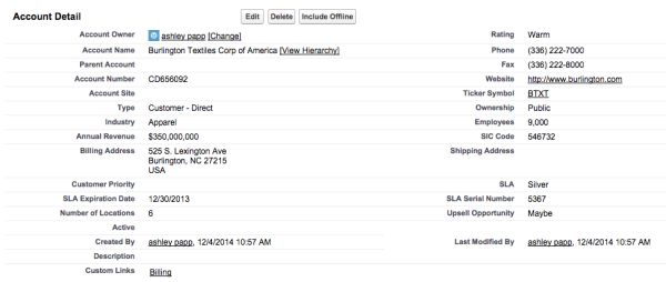
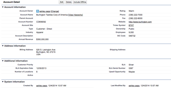
Field Order – Consider the order of your fields. Put fields in an order that makes sense to the user. Make sure important fields aren’t stuck way down at the bottom of the page.
Balance – Balance the number of fields on the left and right. If you have 8 fields on the left and 2 on the right, even it out. It makes better use of the page space and is easier on the eyes. Use Blank Space fields to help keep columns logical.
Sections – Use sections to break up the page and keep like fields grouped together. To add new sections to your Salesforce page layout, click “edit layout,” drag the section field onto the page, fill in the section properties, and then drag related fields into the new section.
Before:
After:
Large Text Areas – Large text areas should get a section all to themselves. Allowing 6 or more visible lines improves readability.
Consistency – Keep Salesforce page layouts as consistent as possible across pages. This will help reduce the learning curve for the user. An example of this is that I always like to keep the Owner, Created By, and Last Modified By fields at the bottom of the page in a section called “System Information.”
Help Text – Make sure you always use help text for custom fields! If you forgot to add the help text while you were building your custom fields, check out this tip to find all fields that need help text. To add help text, navigate to the custom field in the setup menu, click “edit,” and then fill in the description and help text.
Lookup Filters – Decide if your lookups should have filters. Filters will help users pick the correct record, such as filtering out closed lost opportunities.
Required Fields – Take time to consider whether a field should really be required. If you think it should be required, decide if it should be universally required or only required on the page layout. It’s best to err on the side of fewer required fields and have them set on the page layout. To make a field required on the page layout, go to the page layout, click on “edit layout,” hover over the field you want to be required, click the wrench icon, and check “required.”
Search Layouts – Update search layouts so that they provide enough information for the user. Search layouts should be consistent with the fields shown in list views. To edit search layouts, navigate to setup > the object (account, leads, contacts, etc.) > search layouts, and then click “edit” next to search results. From here you can select the fields that you want to show in search results and assign them a specific order.
Before:

After:

Related Lists – Place custom related lists above the standard related lists in your Salesforce page layouts. Anything custom is likely to be used more often and should be easily accessible.
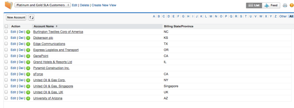
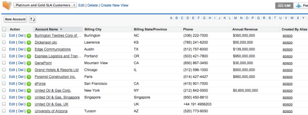
List Views – Update list views so that they show details that are relevant to the user. Displaying relevant fields will keep users from lots of additional clicking since relevant information is already visible.
Before:
After:
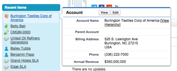
Mini Page Layouts – You can also customize mini page layouts so that they show more relevant information. Click “edit layout,” then “mini page layout,” add the relevant fields, and then click “save.”
Before:

After:
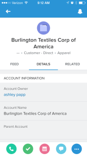
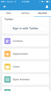
Keep in mind that as you are editing Salesforce page layouts on your desktop that they are also being changed for mobile devices as well. The same sections and order of fields you create for desktop automatically apply to pages viewed on mobile devices. Related lists also show up on mobile devices on a separate tab. Since mobile device screens are much smaller than desktop screens, it is recommended that you set up a specific page layout for mobile. To do this, navigate to setup > object (“Account” in this example) > page layout, then click “new.” From here you can select to clone an existing page layout or start a new one. Fill out the page layout name and click “save.” Then drag and drop the fields you want to show up on the mobile page layouts and click “save.” Now that you’ve created the mobile page layout you need to update the page layout assignment. Click “Page Layout Assignment,” then “Edit Assignment,” and assign the new mobile page layout to the mobile user profile. For more information on page layouts for Salesforce1, check out the Salesforce1 App Admin Guide.
Before diving in and modifying your Salesforce page layouts, make sure the users have been notified of the changes. The last thing a user wants to have is a surprise when a page layout that they’ve been using for years suddenly changes. If possible, include the users in the process of updating page layouts and solicit their input. Additionally, this is a great time to clean up fields and data. Check out these steps to deduping your data.
Once you’ve collaborated with your users about potential changes to page layouts, put a communication plan in place to assure that everyone knows when the changes will take place and also that you’re available to help with questions after the updates take place.
These are many of my favorite tips to make our customers’ Salesforce experience as enjoyable as possible by improving page layouts. What are your favorite tips for improving page layouts? Share in the comments below!


