I was recently presented with a very complex reporting scenario by a customer. The short explanation was that I had to calculate the “Length of Stay” for a patient at a facility. The data needed to be grouped by facility, by level of care, and a count of patients who had been at the facility for less than a year, one year, two years, etc.
It made my head spin! The goal of this blog is to do a high level overview of all the platform features that I invoked to make this report work for our customer. When things like this come together, it is smile-worthy to say the least!
First… The Data!
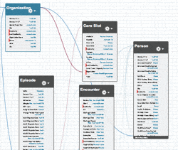
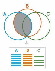
My first challenge was gathering the correct data. The schema was rather complex with joins all over the place. What I had to do was get the right data in one place through a custom report type.

The image above is a reduced size version of the data schema. Suffice to say, getting all of these objects together will prove challenging.

For those who do not use custom report types, they have a few major advantages:
- Allows you to cherry pick the join that you need
- Can choose to show records with or without related records. All the standard joins only pull with related records.
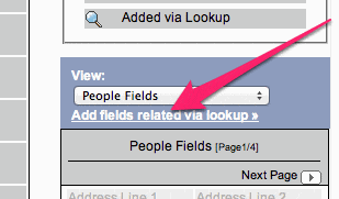
- You get to customize the page layout. Perhaps the most important feature here is the ability to “Add related field via lookup“. This little gem allows you to pull data from higher level objects direct to the report layout for inclusion in a report. This often allows us to get around the join hierarchy & reference other data.

Second – The “Mojo”
At Red Argyle, we usually call it “Mojo” when we need to bend the platform to our will. It more often is referring to code, but i this case, I had to do some formula field mojo to do a few things.
First, I had to calculate the length that someone had been staying at a facility. A field did not exist that had this data, so I created a formula field to run the calculation. This was the formula:
IF(TEXT(Phase__c) = "Enrollment", (TODAY() - DATEVALUE(Enrollment_Date__c)) / 365,0)
Second, had to “Bucketize” the results form this field. It could be done in one field, but I thought it may need to be reported on more discreetly in the future, so I created a 2nd field to do some bucketing for me. The formula looked like this:
IF( Length_of_Stay_Years__c < 1,"< 1yr.",

IF( Length_of_Stay_Years__c >= 1 && Length_of_Stay_Years__c < 2, "< 2yr.",

IF(Length_of_Stay_Years__c >= 2 && Length_of_Stay_Years__c < 3, "< 3yr.",

IF(Length_of_Stay_Years__c >= 3 && Length_of_Stay_Years__c < 4, "< 4yr.",

IF(Length_of_Stay_Years__c >= 4, "> 4yr.","Yup")

)

)

)

)
It’s a little ugly looking, but it met the requirement with a small investment in time. It effectively allows me to categorize any value from the length of stay field into one of five values.
Finally, I had one other bucketing/grouping challenge. I need to display multiple pieces of data in the row area but Salesforce will only allow me to create two row groups. To get beyond this, I created another formula field that puts the Level of Care, Team, and Facility Capacity together, which will display the data that I want to see, but still allow me to group:
IF( Team__c = "", TEXT(Care_Level__c) & " / " & TEXT(Capacity__c) ,

TEXT(Care_Level__c) & " / " & Team__c & " / " & TEXT( Capacity__c))
Third – Build the Report!
I’ve found myself being much more comfortable with matrix style reports of late, they are a great way to do multi axis data comparison. I think the biggest challenge is how overwhelming the UI is. A great way to get around this, is to define your grouping levels and fields that will be on the report as done above before touching the report writer. Then create a tabular report which only has the fields that you need in the finished product. (In this case, 3 fields)

Convert that report to a matrix report, and then drag your fields to where they need to be. Turn off details and you’re ready to rock!

The Moral of the Story is…
The platform does impose restrictions, but with a creative use of the tools in its “toolbelt”, it is possible to go far above and beyond what may initially seem possible. This is just a high level overview of these features, but I believe it illustrates how, when combining layers of simple things, very complex calculations can be made.
Do you have any tricks like this? Please post a comment and share! Thanks for reading – Garry


