Understanding and Mitigating Cognitive Overload in Salesforce Design
Accessible Salesforce Apps, Part 2
Hello, readers! Welcome back to the second installment of our series. If you missed part 1, you might want to check it out; we delved into vision-related design issues—because, apparently, everyone thinks about sight first. But today, we’re diving into the less visible but equally pesky issue of cognitive overload. You’re probably wondering, “Cognitive what now?” Well, let’s unpack that together.

Who Are We Really Building For?
It’s easy to forget that not everyone processes information the same way we do. When setting up Salesforce, consider the following groups who are especially susceptible to cognitive overload:
- Individuals with ADHD: These users might find it challenging to focus if there’s too much going on.
- People facing language barriers: Those who aren’t native speakers may struggle with complex language or jargon.
- Users with dyslexia: Unfriendly fonts and text layouts can be more than just annoying—they can be alienating.
- The sleep-deprived: Let’s face it, that could be any of us on any given day.
- Those distracted by coworkers: Ever tried to concentrate on a cluttered screen while someone’s loudly discussing their weekend plans? Not fun.

What You Need to Know & How It Applies to Your Salesforce Setup
Now that you know who you’re building for, let’s talk about how you can make their lives easier (and yours, by reducing the number of helpdesk calls!).
Simplify Your Layouts
A cluttered layout is the cognitive equivalent of a hoarder’s basement. It’s hard to find what you need in a mess. Keep your Salesforce interfaces as clean and organized as possible. Think Marie Kondo meets software design—if it doesn’t spark joy (or at least clarity), toss it out!
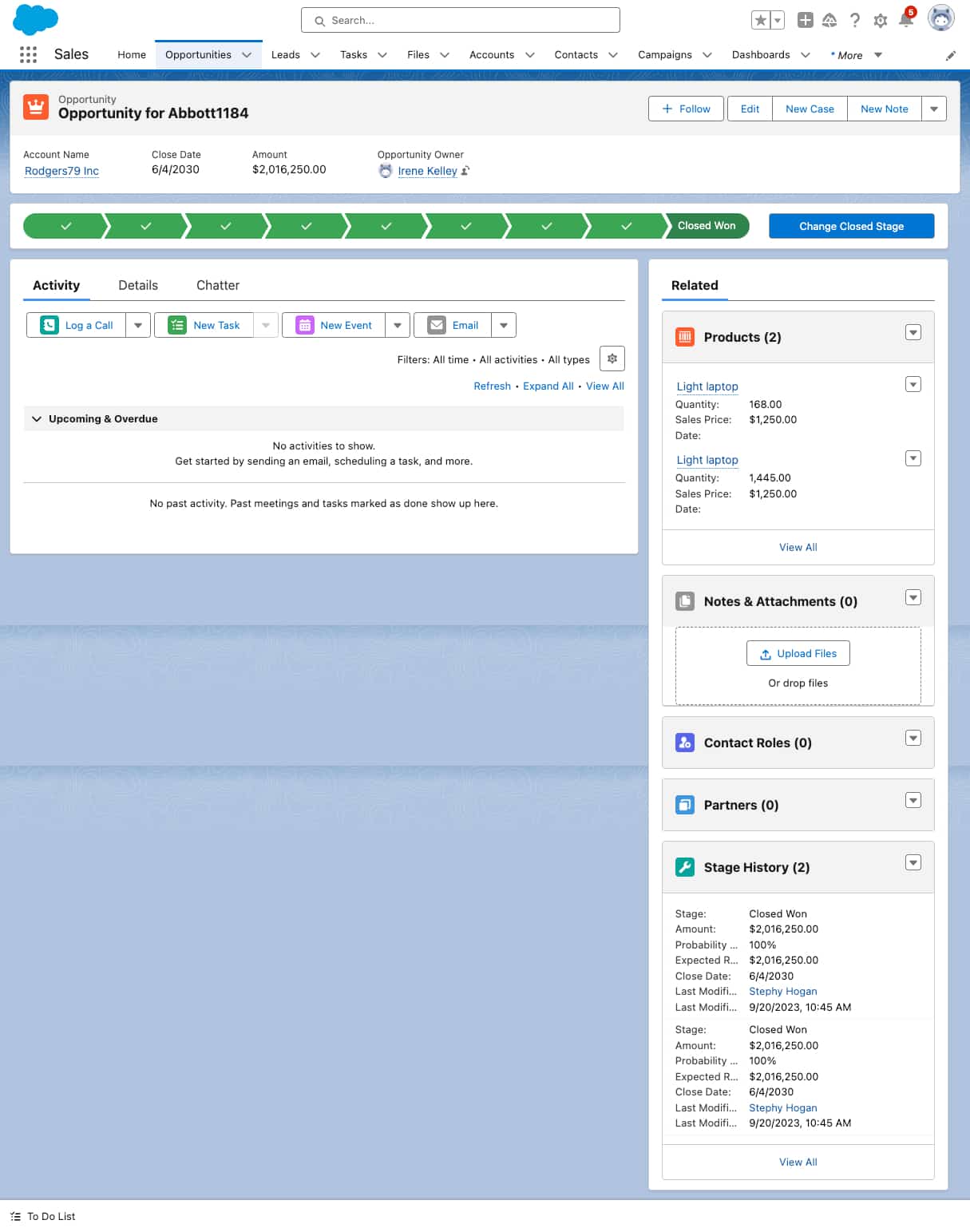
This is where making use of personalized apps, better Lightning page layouts, dynamic forms and screen flows can really make a difference. Just as a quick reference, here’s the default opportunity page layout:

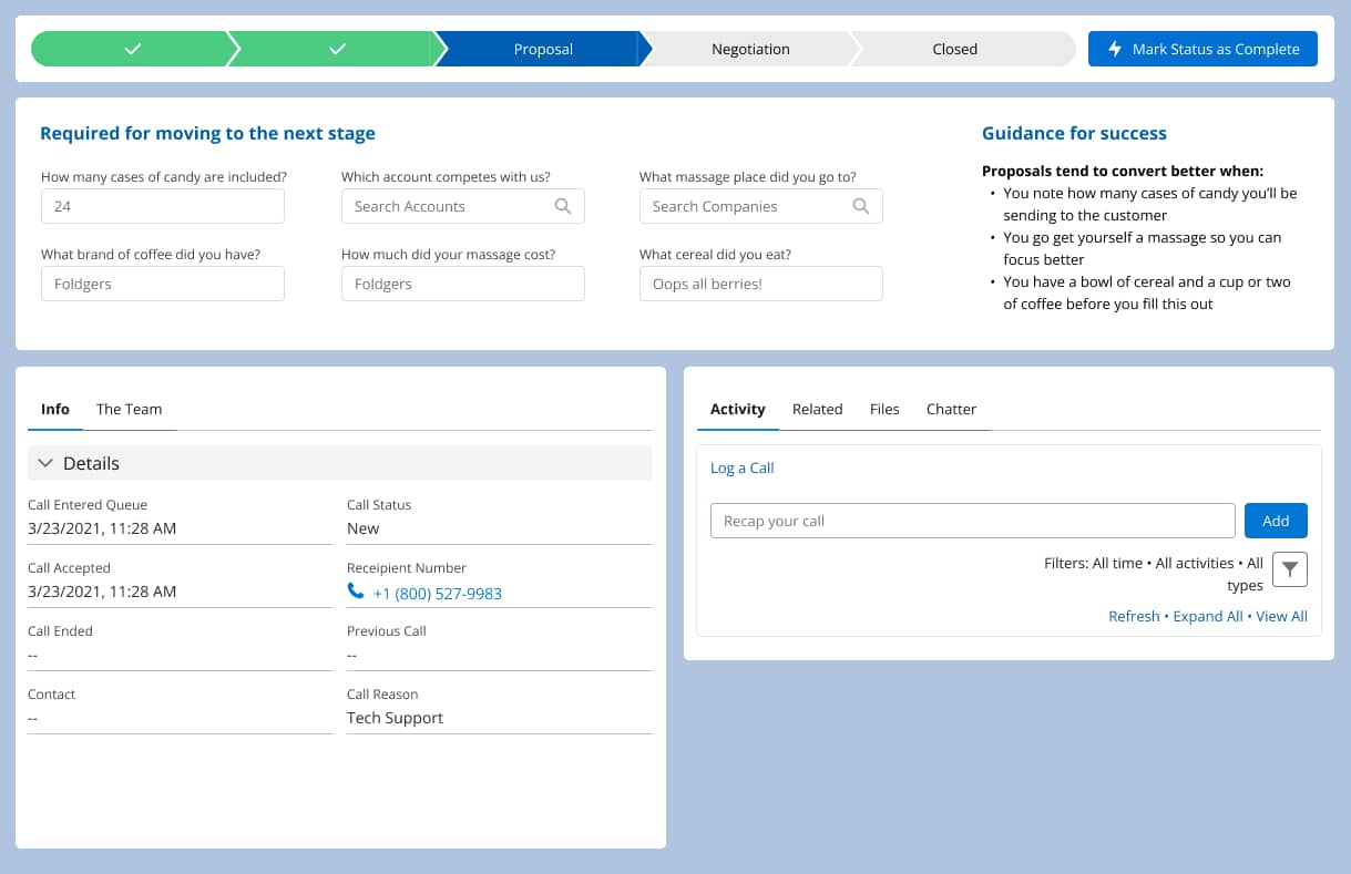
But by talking to your users to find out what they really need and then take a small amount of time to make a new layout, it could look more like this:

When you chunk out what a person is required to fill out and put it at the top, even people having the foggiest of brain days will have an easier time getting the job done.
Use Plain English
Remember, not everyone speaks fluent tech. Use conversational language that’s easy to understand. If you find yourself using phrases like “synergistic management solutions,” it’s time to step back and simplify.
If you haven’t noticed already, Salesforce seems to have a consistency problem when it comes to the vocabulary they use throughout the whole ecosystem. Let’s take care not to exacerbate the issue within field labels, object names, and app names to list a few.

Demystify the Next Steps
Don’t leave users hanging wondering what to do next. Always provide clear, actionable next steps. This could be as simple as a “Submit” button that changes to “Submitted!” to confirm the action. If the process the user is in is a lengthy multi-step one, provide information in each step about any materials the user will need to gather before moving on to the next step. Or provide insight as to what happens after that “Submit” button is clicked and approximate time until next steps will be needed.

Text Alignment and Decoration
Keep your text alignment consistent and avoid using multiple font styles and sizes that can make the content harder to follow. Stick to one or two at most—like a black tie dress code but for your text.
Unless it’s a button, please avoid centered text at all costs.
Avoid Information Overload (TMI)
Sometimes, less is more. Don’t bombard users with all the data at once. Use progressive disclosure techniques to show more information as needed, not all upfront. Screen flows are fantastic in this regard.

Explain Your Data
Make sure any data presented is clearly explained. No one should have to play detective to understand what they’re looking at. And I don’t mean going into a jargon filled diatribe about that data… tell the users why they should care and then provide the information in an easily digestible way. It’s very easy to overwhelm users with 4 list views and 10 charts.
By now, you might be feeling a bit overwhelmed yourself, wondering how to implement all these changes. Start small. Pick one area of your Salesforce setup that could benefit from a little cognitive decluttering, and tackle that first. Your users—and your future self—will thank you for making their cognitive load a little lighter.

So, stay tuned for part 3, where we’ll tackle another thrilling topic: emotional ergonomics in software! Yes, it’s a thing. Until then, keep it simple, keep it clear, and maybe keep a broom handy for all that clutter.
Your journey toward a more accessible Salesforce experience doesn’t have to stop here. If you’re ready to make your Salesforce applications clearer and more user-friendly, contact Red Argyle today. Let’s work together to create a more inclusive and effective digital environment.


