

Hi, I’m Stephy, and I’m an accessible design nerd. Accessibility is very near and dear to me. It’s been my mission to make sure that everyone has equally awesome and usable experiences with the Digital Things they interact with. I love it when people send me articles related to accessible digital design and ask if I’ve seen it. Recently, I was on the receiving end of one such article and while I was pleased that it even existed, I felt like it didn’t go deep enough.
The article touched on 3 things:
- Color contrast
- Keyboard navigation
- Co-create with people who use accessibility features on the regular
But there’s so much more to it. So much so that when I finish writing this post, I’ll probably realize that it’s way too long and will have to be chunked up in a series of posts (can confirm that this is now a 5 part series). But first a very quick overview of what accessibility is…
Designing and building accessibly means that you’re creating something that is equally usable and awesome, let’s say, for a blind, neurodivergent person as it is for anyone else. There are laws (508 compliance in the U.S.) and guidelines (WCAG, universally) around this as well. There are three levels of accessibility in WCAG: A, AA, and AAA. Whenever I speak about accessibility, I’m always aiming for the recommended AA standard.
Knowing all of that, there are 5 types of things you really need to think about when trying to make your Salesforce project accessible (and it makes for a rather memorable acronym, don’t you think?):
- Sight-related
- Cognitive-related
- Hearing-related
- Interaction-related
- Technology-related
Can they SEE it?
Color contrast is where you’re going to go first. It’s the most visually impactful thing to fix and sometimes the most controversial (depending on what the brand colors are). In that regard, you’ll probably get the most pushback from stakeholders when you start fiddling with colors. There are a few other things you need to remember about color usage both in and out of Salesforce. It’s also important to know WHO you’re doing all of this for in the first place.
The Who, sight-related:
- Sight Loss
- Color Blindness (did you know that some people only see in grayscale?)
- Cataracts
- Aging Eyes
- Light Sensitivity
- Screen Glare
The What, sight-related:
Color Contrast
Yes, there’s math, but you don’t have to do any.
Color contrast is derived from comparing the luminance of each color in the pair. Luminance is the amount of visible light that is reflected off of (paper) or emitted from something (screens). Basic example? Black reflects little to no light. White reflects most or all light. And yes. There’s math behind it. If you’re really curious, here it is:
(L1 + 0.05) / (L2 + 0.05)
Isn’t she pretty? So if each of two colors reflects back about the same amount of light (regardless of color), it’ll be really difficult to read because human eyes can’t separate the amounts of light very well. Physics is pℏun (a pun for all my science-minded friends out there).
There are a bunch of different tools you can use to check for contrast.
- Figma users: use the Stark plugin.
- Stark Chrome plugin
- AXE Chrome plugin
- WAVE Chrome plugin
- If you can’t install plugins, go to EightShapes Contrast Grid and enter hex values (be sure to include black and white)
Ratios to remember
4.5:1 Minimum contrast between text and the color it sits on. This is probably THE most important ratio to know. If you forget anything else, please remember THIS one. Yellow, orange, and green are THE trickiest colors to use successfully in any UI. If you have to use one of those colors, pay extra attention to how they’re being used.
3:1 Minimum contrast between text larger than 18 points (24 pixels) and the color it sits on. Personally, I always aim for 4.5:1 no matter what size the text is. Why? Let’s call it a safety net for those parts of a site where users enter content. The more users who think 4.5:1 is The Rule, then the chances of 10pt font paragraphs occurring are low.
3:1 Minimum contrast between interactive elements and the color they sit on. Things like buttons and inputs, for example, need to contrast enough from the background for users to know that they’re there and that they’re interactive.
Fun fact… points and pixels aren’t a 1:1 conversion. 1 point = 1.33 pixels.

Another fun fact is that there IS such a thing as too much contrast. Wild, I know. People who have light sensitivity issues have trouble with pure black on pure white and vice versa. People with autism can have issues with really saturated colors. Text will vibrate to those with Irlen Syndrome or other light sensitivity issues. Moderation is key.
Salesforce has somewhat recently fixed a TON of contrast issues in the interface. They improved colors for charts! They allow you to choose an accessible version of your brand color in themes! Pretty nifty. However, there are still a lot of areas that need improvement. Charts are better, yes. However, no one has yet taken into consideration the contrast between adjacent chart colors. For example, no one can see the difference between the light blue and the dark teal donut slices:
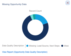
I hear a few of you saying, “But there’s a legend!”
Friends.
Lean in closely.
Just because there’s a legend doesn’t mean anyone can tell which label goes where when the same color issue exists in the legend. Also… this chart shouldn’t be a donut chart and all of the bars should be directly labeled. Problem is that Salesforce doesn’t allow you that much control. Here’s to hoping there will be an update that fixes this in the future.
This chart is also an excellent segue into the next point.

Color can’t be the only indicator of meaning
The way that chart is currently set up, color IS the only indicator of meaning. And this leads me into my second biggest pet peeve with the Salesforce interface. Links. Default Salesforce style is no underline–just a color change. No bueno, Salesforce. Color cannot be the only indicator of meaning. If you have the power and ability to do so, reader, whenever possible, get that underline in there.
Font size considerations
How old are your eyes? What’s the resolution of your screen? And can someone please tell me why Salesforce chose 13pt to be the default paragraph text size? Best practice is no smaller than 16pt for that kind of text–even input label and placeholder text. I don’t think that day will ever come, so please, for me: don’t go below the standard Salesforce size of 13pt.
And that’s a wrap on part one of our series on accessible Salesforce apps. We’ve begun to uncover the essentials, but there’s so much more ahead. Stay engaged and ready for the next chapter, where we’ll delve deeper into hearing-related considerations. Your participation is key to our collective success in creating inclusive digital environments! If you’re ready to make your Salesforce applications more accessible, contact Red Argyle today. Let’s work together to create a more inclusive digital world.