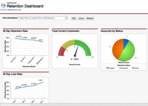
 Salesforce reports are a great way to view and analyze your data. If you’re new to Salesforce reports check out our Introduction to Salesforce Reports. That will give you the basics for understanding reports before you dive into Salesforce charts and dashboards. Salesforce dashboards and charts are a helpful visual representation of your reports. Since dashboards and charts are much faster to look at and understand than reading a report they come in handy. Here are some tips for getting started using charts and dashboards.
Types of Salesforce Charts
There are a few different ways that you can summarize data with Salesforce charts. Depending on the type of data you have there are a few different charts you can use.
- Vertical and Horizontal Bar Chart (Use horizontal bar chart to compare more groups than vertical)
- Line Chart (best for showing data over time)
- Pie / Donut Chart (Both are used to compare a group of data to the total. Donut Charts show the total in the middle)
- Funnel Chart (best for sales opportunities)
- Scatter Chart (Helps to visualize the correlation between values on a report)
How to add a chart to a Salesforce Report

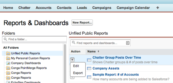
- Find the report that you want to add a chart to
- Select Edit from the drop down (looks like an arrow)
- Click Add Chart and the chart editor will pop up
- There are two tabs: Chart Data & Formatting. Chart Data controls what information is displayed. Formatting changes the appearance of the chart.
- Run the report and Save
Salesforce Dashboards
A Salesforce dashboard is a quick way to view summary data from multiple reports at once. You can have up to 20 components on one dashboard. Anyone with access to run a report and access to the specific report folder can view dashboards. Unlike Salesforce reports dashboards need to be refreshed to show the most current data. There are four types of dashboard components in Salesforce.
- Table
- Chart
- Gauge
- Metric
How to Create a Salesforce Dashboard
The Salesforce dashboard builder is very similar to the chart builder.
- Go to Reports
- Click New Dashboard
- Set the running user (by default it is the user creating the report)
- Drag and Drop the components and data sources into the into the dashboard builder
- To change something on your component click the wrench icon to open the component editor
Creating reports and dashboards in Salesforce can quickly become very complicated, especially in a large Org. If you need advice on your Salesforce dashboards and reports give us a call, we’d be happy to help.


